
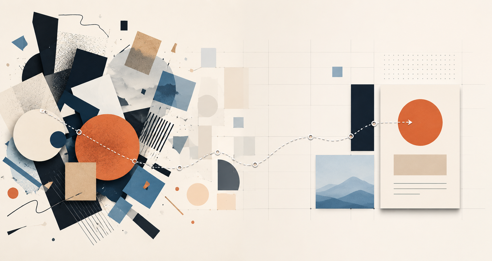

We are surrounded by things that look designed, from beautiful websites and polished social media posts to professional presentations and AI-generated images created in seconds. The tools for producing professional-looking visuals have never been more accessible, but looking polished and being well-designed are not the same thing.
I see this distinction every semester when new students enter my graphic design classes. Many arrive expecting to learn Illustrator, Photoshop, typography, color, and the tools that will help them make things look professional. Those skills matter, of course, but one of the first ideas I want them to understand has very little to do with software. Looking good is not the same as good design.
Design Begins With a Question
It is easy to associate graphic design with what we see—the colors, photographs, typefaces, illustrations, and layouts—but design begins before any of those decisions are made.
Who are we communicating with? What do they need to understand? What should they notice first? And what do we want them to do next? These questions apply whether you are designing a poster, building an app, preparing a presentation, creating an online course, or developing a website for a small business.
The visual decisions matter, but they come after we understand the problem we are trying to solve. That is where design really begins.
Something Can Look Good and Still Not Work
Imagine opening a beautifully illustrated restaurant menu but struggling to find the entrées, visiting a small business website with impressive animations but being unable to figure out how to schedule an appointment, or seeing an event poster with beautiful typography but having to search for the date and location.
Each example might look professional, yet each still has a design problem.
Good design asks more than whether something looks good. It asks whether it works for the person using it. That changes how we think about the designer’s role because we are no longer simply decorating information; we are deciding how to organize it, what to emphasize, what to simplify, and sometimes what to remove.
Design Is Happening Everywhere
Design thinking is not limited to people with “designer” in their job title. A UX designer deciding where to place a button is considering human behavior and expectations, while a professor organizing an online course is deciding how students will access information and navigate a learning experience. An entrepreneur developing a landing page has to consider what a potential customer needs to understand before making a decision, just as a small business owner has to decide what customers should see first when they arrive on a website.
The professions, tools, and outcomes may differ, but beneath them lies a similar question: What does this person need, and how can I make the experience clearer? That is a design question.
Beautiful Still Matters
None of this means aesthetics are unimportant. They matter enormously. Typography creates hierarchy and personality; color can establish mood and direct attention; photography can create an emotional connection; and white space can make complicated information easier to understand. Visual quality can also influence whether something feels credible, professional, and trustworthy. The difference is intent.
A designer does not choose a color simply because it is attractive; they consider whether it supports the message and connects with the audience. A typeface should do more than look interesting; it should communicate the right personality while remaining readable. An image should contribute something meaningful rather than simply fill an empty space, and sometimes the best visual decision is not to add another element but to remove one.
Aesthetic choices become design decisions when they have a reason.
Better Tools Do Not Automatically Create Better Design
This distinction becomes even more important as tools such as Canva, Adobe Express, Figma, Adobe Creative Cloud, and increasingly capable AI platforms make visual production accessible to more people.
That accessibility is a positive development. Someone running a small business can create a social media graphic without hiring a designer for every post, a student can explore ideas more quickly, and a professional designer can automate repetitive parts of a workflow and spend more time developing and refining the concept.
But easier production introduces an interesting problem. If almost anyone can create something polished, what makes the work good?
A template can provide a professional layout, AI can generate an impressive image, and software can suggest colors, remove backgrounds, resize graphics, align objects, and produce variations in seconds. What those tools cannot automatically determine is whether the result is right for the communication problem.
Is it appropriate for the audience? Is the message clear? Does the visual hierarchy direct attention to the right information? Does every element support the goal, or is something creating unnecessary confusion?
Those are judgment calls, and as our tools become more capable, judgment becomes more valuable, not less.
From “I Like It” to “It Works Because”
One of the most important changes I see in beginning design students happens when they begin changing the way they talk about their work. At first, design decisions are often explained through personal preference: “I like this font,” “I like blue,” or “I thought this looked better.”
There is nothing wrong with having preferences—designers have them too—but professional design requires another level of thinking. Over time, I want students to move from simply saying what they like to being able to explain why a design decision works.
A typeface might work because it creates the hierarchy the information needs. A color may provide enough contrast for something important to be noticed. A layout can make information easier to scan, while a particular image may better represent the audience we are trying to reach.
That transition from preference to intention is one of the foundations of becoming a designer, and it is also a useful way of thinking that extends far beyond the design classroom.
Start Looking at What Design Does
The next time you visit a website, open an app, read a menu, see an advertisement, or scroll past a social media graphic, try looking at it differently. Instead of beginning with whether you like it, notice where your eye goes first, what you understand immediately, what feels effortless, and what makes you hesitate or search for information.
Then ask a simple question: What is the design helping me do?
Once you begin looking at visual communication this way, design becomes much more than colors, fonts, images, and software. You begin to recognize the decisions behind what you see and understand why some experiences feel clear while others create friction.
In a world where our tools can create polished visuals faster than ever, that ability may become one of the most valuable design skills we can develop. The tools can help us make things, but design begins when we understand why we are making them, who they are for, and what they need to accomplish.